

Overview
One of the most important aspect of CSS is the Box Model. A developer who fails to get a firm grasp of the box model will have difficulties in design. This is because design sketches should be done with box-model in mind and it is used to reduce code complexity.
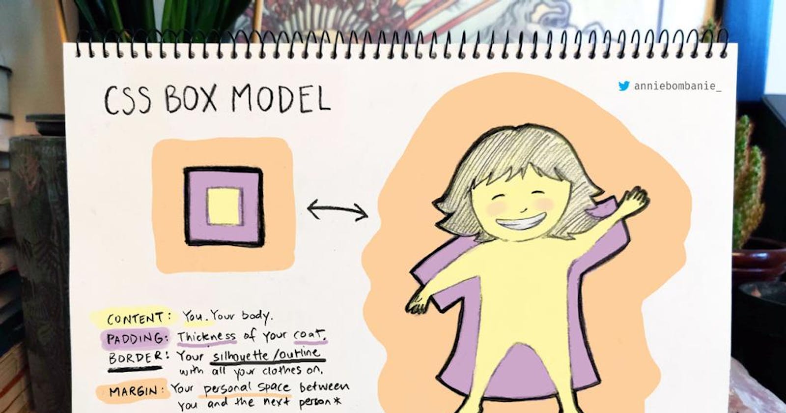
The content, padding, border, and margin makes up the box model in CSS.
Content - The content can be a paragraph, a div, or any other html element which can hold text, images and absolutely any input in your project.
Padding - The padding is a space around your content and its neighboring contents. The padding clears an area around a specific content. The padding is transparent.
Border - A border that goes around the padding and content.
Margin - Margin is the space around an element and its neighboring elements. It clears an area outside the border. It's also transparent.
Study the image above for better understanding
How-to: Padding and Margin
One thing is to know the concept of a thing, the most important is to understand many ways of putting it to a good use. This will give you better understanding and enhance efficient use.
The margin and padding have similar syntax and ways of declaring them in our code and there are many ways to which you can use the syntax rules. I will explain everything below using the padding as an example.
Setting padding for a specific side -
padding-left: value ;- sets padding of the specific value to the left side of the content.padding-right: value ;- sets padding of the specific value to the right side of the content.padding-top: value ;- sets padding of the specific value to the top side of the content.padding-bottom: value ;- sets padding of the specific value to the bottom side of the content.
Using the shorthand rules -
padding: value;- sets padding of the specific value to all sides of the content.padding: value1 value2;- sets padding of value1 to the top and bottom of the content and value2 to the left and right of the content.
padding: value1 value2 value3;- sets padding of value1 to the top of the content, value2 to the left and right of the content and value3 to the bottom of the content.padding: value1 value2 value3 value4;- sets padding of value1 to the top, value2 to the right, value3 to the bottom and value4 to the left of the content.
The value specified in the above explanation are measurements. We have two types of measurements
- Absolute- This is set to a specific size; px, mm, cm, pt....
- Fluid- sets size to relative to surrounding elements.
- %, vw (viewport width), vh (viewport hieght).
- em(for font) :
1emis current size,.75emis 75% of current size- rem (for font) :
1remis current size of the root.The above explanation on padding also applies to margin
Setting the border
The border has three general values which are:
border-width- which can be specified using any measurement rules.border-style- can bedotted- This defines a dotted borderdashed- Defines a dashed bordersolid- Defines a solid borderdouble- Defines a double border.groove- Defines a 3D grooved border. The effect depends on the border-color value.ridge- defines a 3D ridged border. The effect depends on the border-color value.insect- Defines a 3D inset border. The effect depends on the border-color value.outset- Defines a 3D outset border. The effect depends on the border-color value.none- Defines no border.hidden- Defines a hidden border.
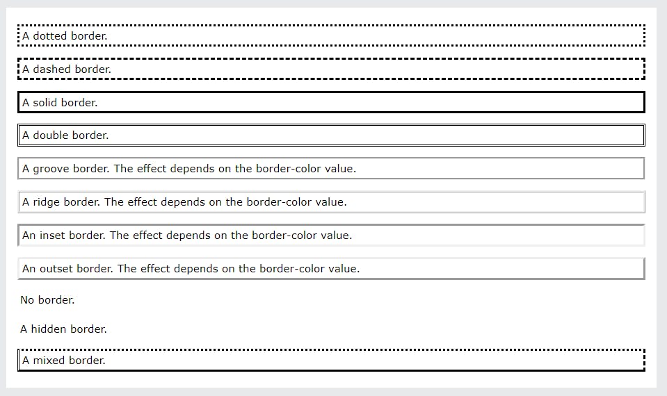
border-color- It can be any color.
You can use the above separately or use the shorthand rule below:
border: 2px solid #fff;
The above code sets up a border of solid white 1px thick border around the content.
Setting up a border at a specific side of the content by using
border-*: width style color;. The asterisk stands for the side you desire which is either top, left, right or bottom.
e.g
border-bottom: 2px dotted #0000ff;
The above sets up a blue dotted 2px thick border at the bottom of the content.
**This is for shorthand rule**
You can also specify is it separately using border-*-*: value; where the first asterisk stands for the side and the second stands for either the style, width or color of the border.
e.g
border-top-width: 1px;
The above sets up a 1px border at the top of the content.
Actual Length and box-sizing
When you set the width and height properties of an element with CSS, you just set the width and height of the content area. To calculate the full size of an element, you must also add padding, borders and margins.
So the actual width of an element will be:
Actual width= width + margin (left or right or both: if specified) + padding (left or right or both: if specified) + border (left or right or both: if specified)
The actual height can be calculated similarly adding the margin, padding and border. But in this case, we add the top and bottom.
e.g.
div {
     width: 50px;
     height: 20px;
     margin: 10px;
     padding: 5px 3px;
     border: 2px solid #000;
   }
The actual width of the above div will be : 50px + 10px (margin-left) + 10px (margin-right) + 3px (margin-left) + 3px (margin-right) + 2px (border-left) + 2px (border-right) which adds up to 80px.
Calculate the height for better understanding.
This is where the box-sizing property comes in.
The `box-sizing has two values:
content-box- which is the default additivesborder-box- which takes content, padding, border and margin into consideration. When specified on an element, the width is width without any additives.
Specify
box-sizing: border-boxinside the universal selector*at the beginning of your code for best practice.
If you find this helpful or have some insights that can improve meyou can contact to give me some tips or some words of encouragement to write: Twitter, Linkedln, email.
Thanks for reading...